
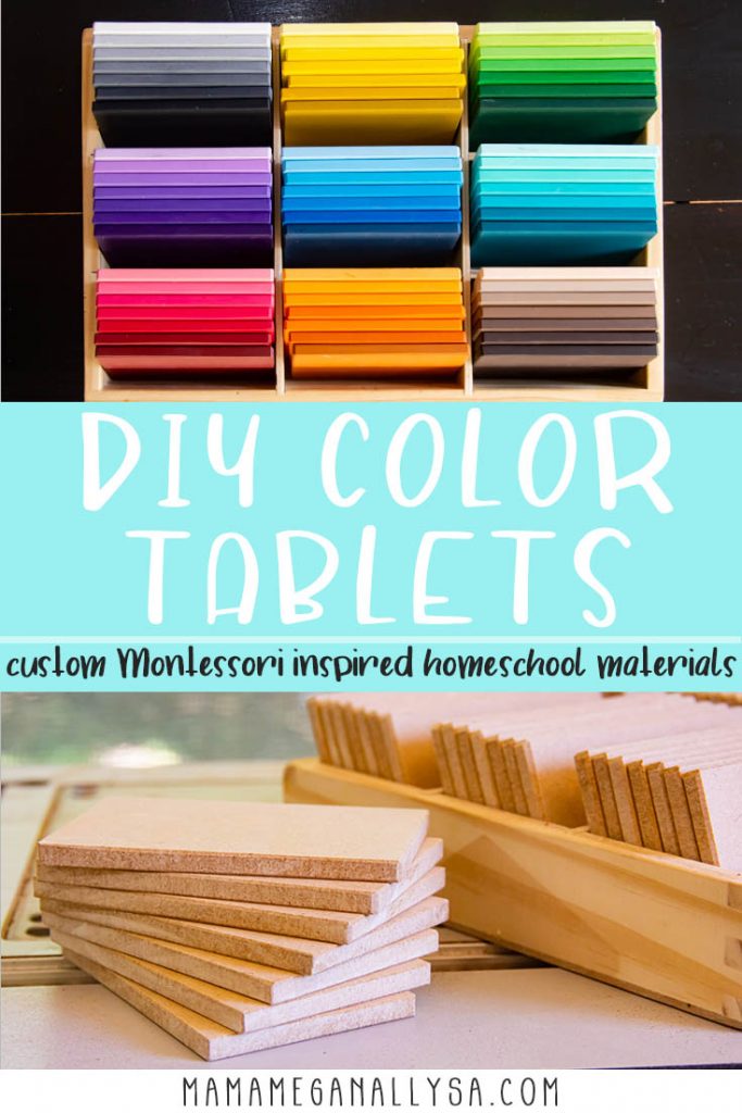
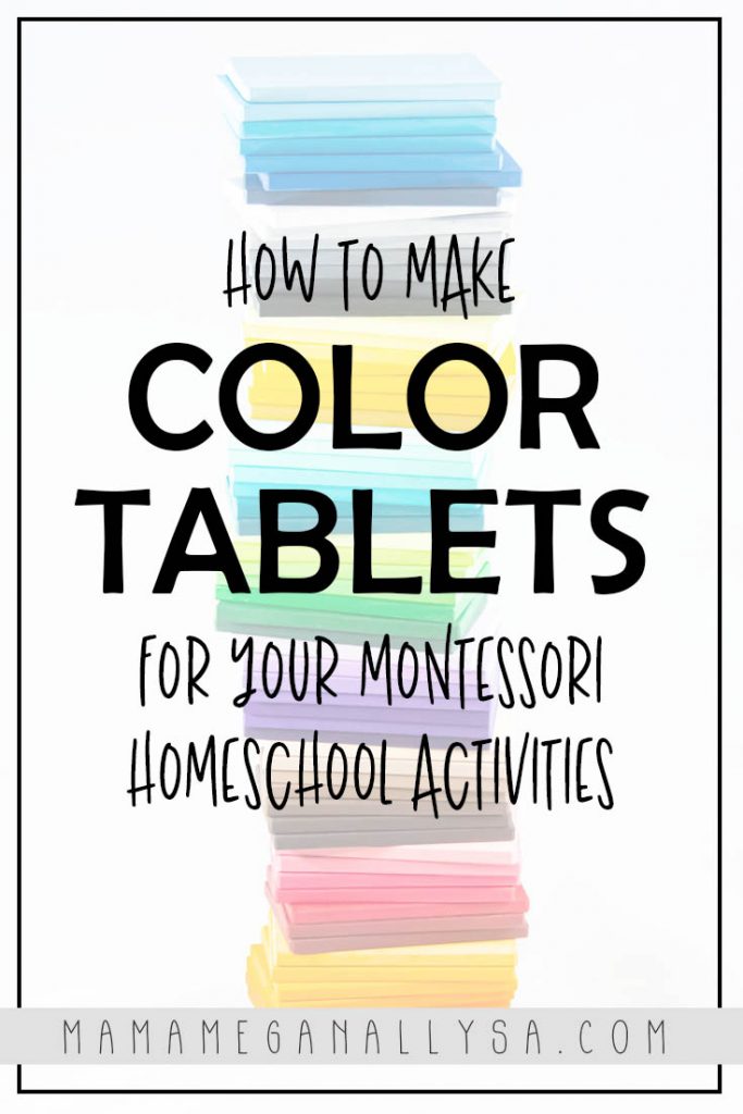
One of the most beautiful Montessori materials is the sets of color tablets. There is just something about the rainbow of shades sitting so neatly in the box that I find so inviting! I knew I just HAD to do my own take on them and create some DIY Montessori Color Tablets!
If you have been around the blog for a while you know that I tend to take things a step or two too far. At least when it comes to rainbows…
…my DIY Montesssori color tablets are no different…

What ARE Montessori Color Tablets?
They are simple tiles that depict colors and in a true Montessori setting you would present the color tablets in a 3 box series.
- Box 1 would have a pair of tiles for each of the primary colors
- Box 2 would have two tiles that have a matching shade for each color of the rainbow plus the neutrals and pink
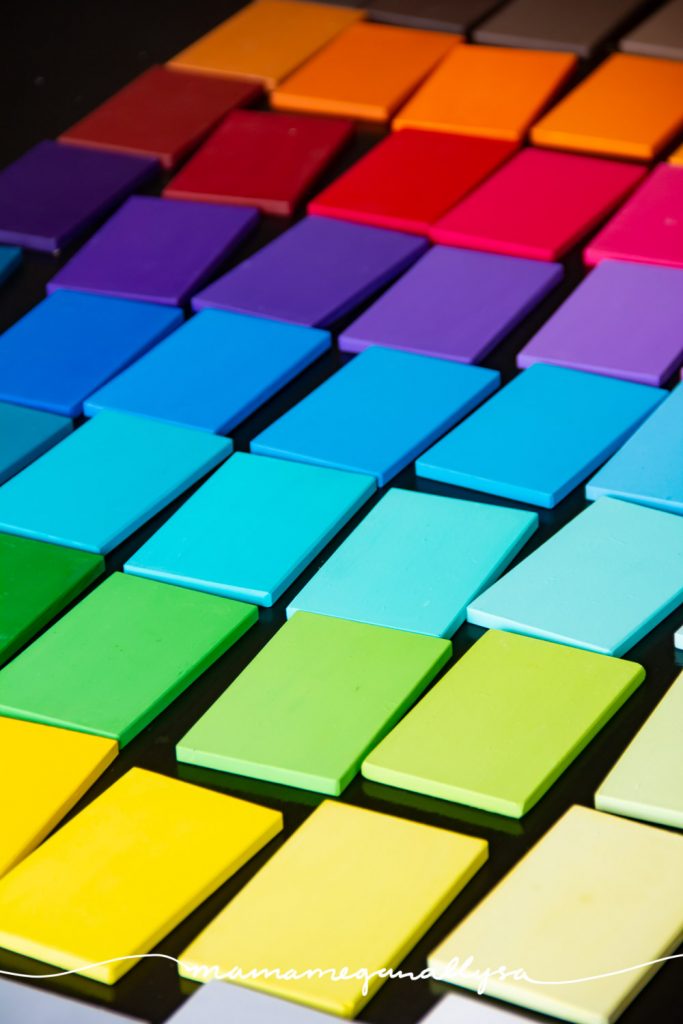
- Box 3 would have 7 shades of 9 different colors (ROYGBV, Pink, Brown and Gray)
Box 1 and 2 are used primarily for matching, box 3 is more about discriminating color and learning shades
The Montessori Primary Guide can give a much more in-depth guide as to what they are and how to use them properly.

I gotta go and make things harder for myself…
As mentioned I never do things the EASY way when it comes to rainbows. I had plans for an activity using some of my other DIY toys, where I wanted the paint to match EXACTLY.
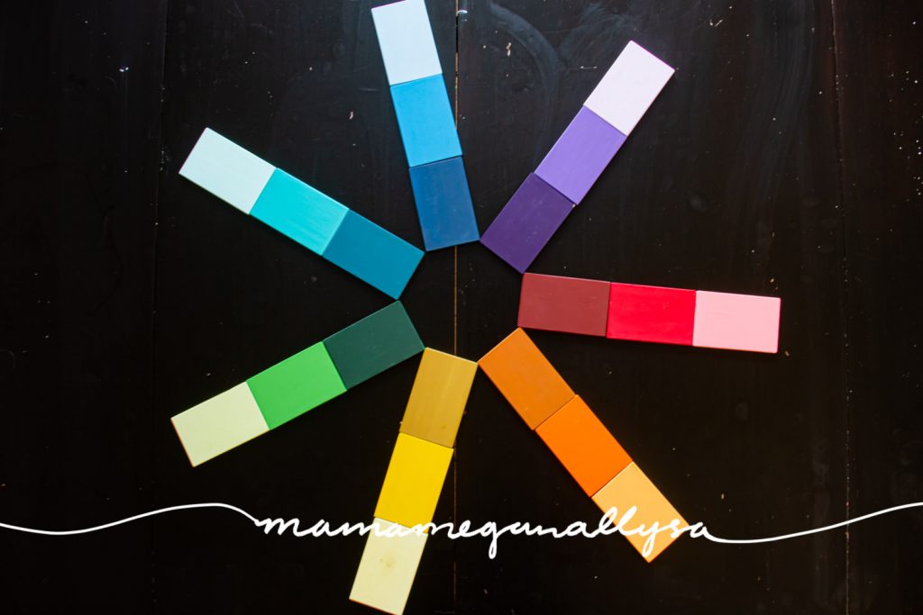
To do that I needed to pick up 3 of each of my colors. A dark, a medium or true, and a light. I didn’t want to try and custom mix the mid-tone.

The problem is finding that trio in each of my colors was not as easy as you might think…I kept dealing with slight changes in the undertones of one or the other and it really made getting a smooth gradient tricky.
Here are the colors that I used if you want to use them as a jumping off point! Most everything was Anita’s Acylic craft paint
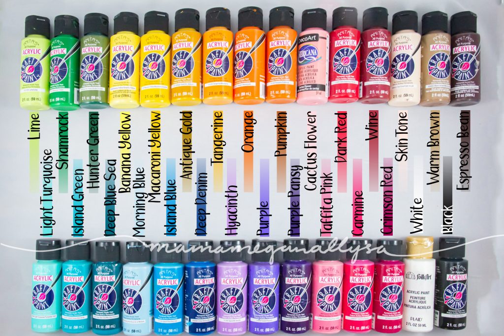
- RED/PINK – Wine, Dark Red, and Cactus Flower (decoArt Americana)
- ORANGE – Pumpkin, Orange, Tangerine
- YELLOW – Antique Gold, Macaroni Yellow, & Banana Yellow
- GREEN – Hunter Green, Shamrock, & Lime
- AQUA – Deep Blue Sea, Island Green Light Turquoise
- BLUE – Deep Denim, Island Blue & Morning Blue
- PURPLE – Purple Pansy, Purple, Hyacinth (this was a HARD tri to mix)
- BROWN – Espresso Bean, Warm Brown, & Skin tone
- GREY – Black and White


Would this have been SO much simpler had I just picked up a light and a dark for each and had them meet in the middle? Yes 100 times over, YES. It is what I strongly suggest you do if you want to attempt your own DIY Montessori color tablets. Did I listen to my own advice? No. FULL STEAM AHEAD!!!
This post contains some affiliate links. As an Amazon Associate, I earn from qualifying purchases. I may receive a small commission from if you follow and decide to purchase. There would be no additional cost to you!
DIY Montessori Color Tablets Supplies
- MDF
- Miter saw – for cutting each tile
- Table Saw – for breaking down the bigger board ( if you don’t have access you could do the cuts with a skill saw or circular saw)
- Sander – you are always welcome to hand sand or use an orbital, i just find the belt sander quicker and easier
- Acrylic Paint – 9 different colors with at least 2 shades in each color
- Matte Modpodge
- Paintbrushes
- Paint palette

DIY Montessori Color Tablets Step one: Create the Tiles
If you look around Pinterest for DIY color tablets you will notice that plenty of people just use heavy-duty paper. I wanted something even thicker and sturdier.
MDF seemed like the logical choice. I wouldn’t feel bad painting it, it’s relatively cheap and it would stand up to any toddler hijinx.
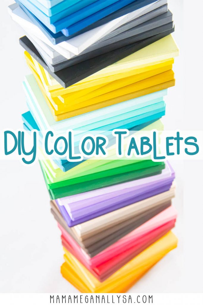
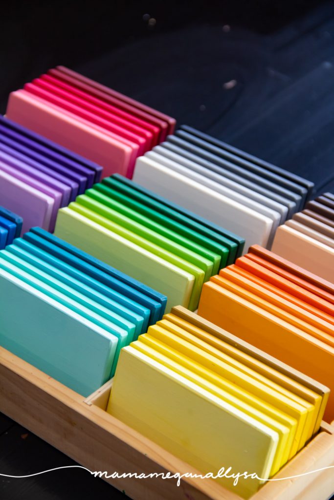
We bought a half sheet of MDF from Home Depot and I got more than enough tiles out of it. I linked a set of smaller sheets on amazon! I planed on using a divided tray I already had for storage so I just measured the size of my boxes and cut the tiles to size. They ended up being 2.5×4, and it’s honestly a really good size. Large enough for little hands to manipulate or sort onto but not too big where they take up a ton of room.

After they were all cut I got to sanding. Lots of sanding. I find myself sanding a lot now that I think about it.
MDF isn’t rough, but the cutting did leave some snaggles that needed smoothing down. In addition, I wanted the edges to be chamfered. That’s fancy woodworker speak for a 45 degree routered edge. I didn’t use a router but you can bet your sweet bottom next time I will. It wasn’t had work it just took a while…
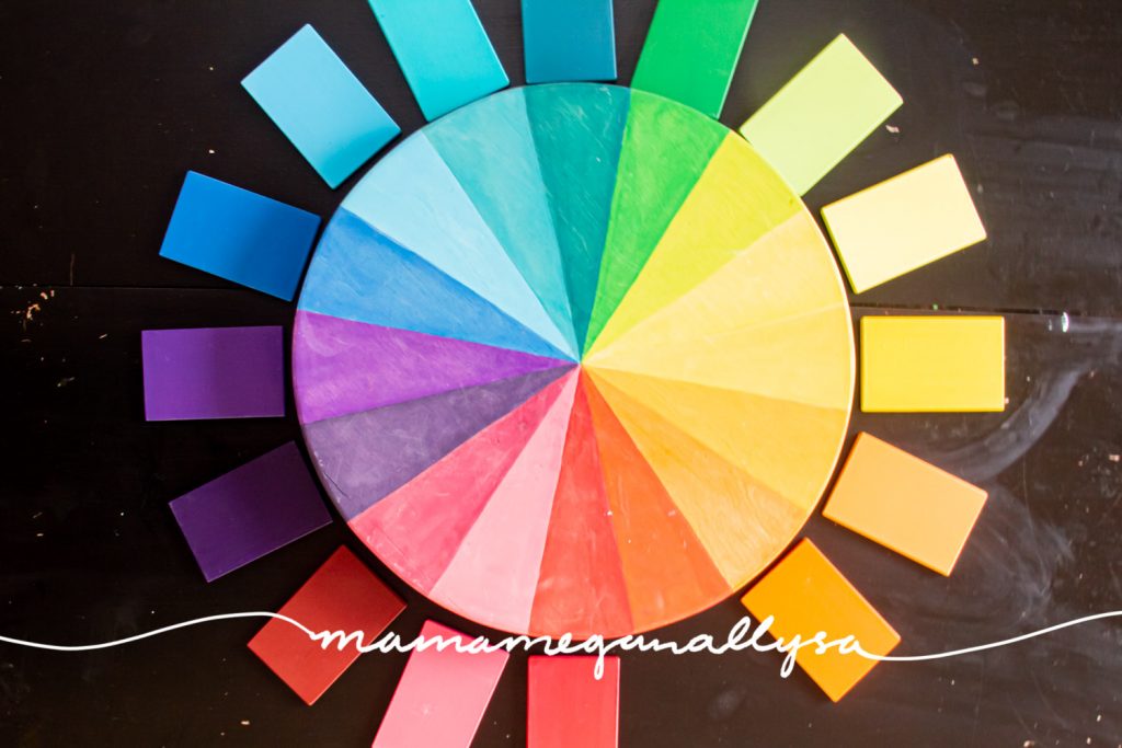
Painting is when DIY Montessori color tablets really start to take shape!
Break out your paint and pallet. Trust me on this one your color to want a pallet.

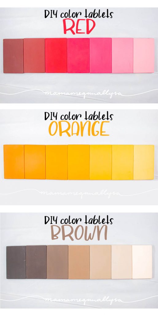
My tactic was to paint my three key colors first and then from there. One gets the darkest color, one gets the lightest and one gets the middle tone.
Then mix some of the middle tone with just a bit of the dark for a darker mid-tone and then take the lighter tone and add just a bit of the mid-tone for a lighter mid-tone. I know it was a lot of tones just there….
If Light is 1 and Mid is 3 and Dark is 5. To get 2, mix more 1 with some 3, and to get 4, mix more 3 with a bit of 5. Does that help any?!
Remember that dark is always a stronger pigment than light so always use less dark than you think you’ll need.

Right now you’ll have 5 of your tiles done. Depending on what your starter trios looked like and how the gradient is coming together you will take a couple of different paths at this point.
If the gradient feels good with the 5 tiles you have then for the last two tiles you will make an even darker by adding the smallest amount of black to your dark and some white to your lightest tone.
If it feels like there is too big of a jump in tones somewhere in your five then try custom mixing your mid-tone with the light or dark in a different ratio than you did before to see if it fills the void.


The biggest piece of advice here is the hardest to follow in practice
Allow your tiles to dry before you decide if you need to alter a shade. The paint will look different wet vs dry. I ended up fiddling way too much with purple and orange because I couldn’t just step back and let the paint dry!
Rinse and Repeat.
You’ll likely find that each new color offers its own new challenges if you follow this method. Thus why I urge you to not use the three tones. It needlessly complicated things by introducing a different set of undertones to deal with.
DIY Montessori Color Tablets Step 2 – Seal Them
I have yet to do this step I need to. The acrylic paint that I used is transfering fairly easy and picking up odd marks. I will likely pick up some matte mod podge as I like the matte finish.
Give each side a good coating, allowing it to dry before flipping over of course, and boom there you go finished color tablets.
How we use our DIY Montessori color tablets?
You can probably think of a few color matching activities and of course, there is the arranging gradient order but if you want more details on how we use our DIY Montessori color tablets in our homeschool preschool lessons there is a post coming very soon!
So was it all worth it?!
Are my DIY Montessori Color Tablets perfect? Not in the slightest! There are errors in gradient, errors in my beveling, errors in my painting, and already some scuffs and scratches in the paint.
Do I still swoon over these babies and want to make more in other tones? YES! I have plans for a more mauve purple and a more orange-red, and I think a good indigo as well as a warmer brown.

I also want to make a few extras of the true tones so I can make the second box and be ready for color matching activities with Bean!
Be on the Lookout for more DIY Montessori color tablets!
If you want to see how these other shades come out make sure and follow me on Instagram where I will share the finished results as well as the foreseeable frustrations when my color mixing doesn’t happen the way I want it to! lol
OTHER POSTS YOU MAY LIKE


hi these are so cool! i’ve ordered all the material and can’t wait to make them! Im just curious how you ended up doing the reds and the pinks? you put 6 colors for that group. which three did you end up using?
should I make 2 separate pallets for them?
I ended up using Wine, Dark Red,(Anita’s) and Cactus Flower (decoArt Americana) the first time around. I am actually planning on repainting my reds/pinks and making two separate sets. I think I am going to treat the reds as a maroon to more of the red-orange side of red and then the pinks will be more a purple-toned pink to a nice light/white pink…this is all in my head right now, though.
Ultimately I would suggest you pick a dark maroon and a true red with the same undertones. Blend these together to get your mid tones and then use white to blend lighter.
Thanks!
Do you remember where you got the storage box ? Thank you
It came with a set of wooden cars from Melissa and Doug.